Introduction Statement

Hi my name is Haley, currently I am finishing up my senior year at Washington State University studying the field of Interior Design. I am interested in interior design because it is a chance for me to be creative and have fun learning new computer programs such as Revit, AutoCad, and Maya. To me design means that I can use my own ideas and create something that reflects me. The thing that inspires me is the finished product, and any designer that can take a poorly designed, unorganized room and make it flow as functional as possible while still looking appealing. In my future , as a designer I want to be involved in my career and always increase my knowledge about the industry, art, and cultures.

Wednesday, December 5, 2012

St. Elmo Hotel- Apartment Design


These are my design posters for a one bedroom apartment in the Palouse called the St Elmo Hotel. I started out designing the kitchen and bathroom of the two bedroom apartment as you can see below. Then moved to the one bedroom apartment. I created everything included in it and made a really detailed model. I made the apartment as open as I could. I started off by having the kitchen open up to the living room. The bedroom and bathroom doors are directly across from each other for a convenient way to enter the bathroom without having to walk through the living room. Through out the whole apartment I used a neutral color scheme with green and brown accents, to bring the whole place together. The apartment has some ADA features which include, a 5ft turning radius in all the rooms, and there is a 3ft distance from the bed to the wall for easy access. I also added a drop down ceiling in the bedroom over the bed with lighting, to add extra light to the room. Some challenges for me was arranging my poster, I did not think the posters are arranged as well as they could be, I spent almost 2 hours to find a layout for them, but I could not come up with them, and now they have a lot of white space and look every plain, even though I put a lot of work into them. My success in this project was the model, I love making models and when it's all done it is very fun to look at. I drew all the walls to the apartment in my model so the viewer can really get an idea of what the apartment actually looks like. The model is a very important element to my design.

Wednesday, November 28, 2012

Designer Feedback


I visited the Northwest Design Center in Poulsbo, WA. While I was there I talked to a professional designer and she gave me feedback on my floor plan and concept board on the St. Elmo Hotel I am designing. I found the visit helpful, because she gave me ideas about adding furniture in all the open spaces I had, and she told me how I could make the apartment look bigger without it actually gaining square footage. I wished that my designer spent more time with me discussing my plan more because some of the things she was saying, I had already new. But I am going to incorporate her input into my design by adding different floor levels and maybe adding a drop down ceiling to add the illusion of square footage. All in all I am glad I had the experience to meet with a professional designer and a chance to expand my resources.

Tuesday, October 23, 2012

St. Elmo Bathroom Design

Like my kitchen design poster, this is my process for the St. Elmo Hotel bathroom, in the two bedroom apartment. This poster was created through my process that I generated from an inspirational quote. It includes a 60" in diameter turning radius for a wheel chair, and roll under sink for a wheel chair, a front and side mount onto the toilet, and a lot of cabinet space to make it very ADA functional. I learned that time is very important when you have deadlines, and to use my time more wisely, and to not wait til the last few days to do everything, because the work piles on. I think my bathroom is appealing and very functional for any person.

Monday, October 8, 2012

Wheel Chair Exercise


These pictures are related to a wheel chair exercise I had to complete with a partner. We went around a building on our campus in a wheel chair and had to complete tasks in the wheel chair so that we would have to experience what other people who really have to use a wheel, would experience. At first I did not think it was going to be a learning experience but when I actually got in the wheel chair and performing the tasks I pointed out everything in my head that was different then walking. I could not fit in some bathroom stalls and turn around, it is extremely difficult to be in a wheel chair and it would be very helpful to have more buildings that are accessible to the needs of people in wheel chairs. It was a very good experience and an eye opener to what I need to incorporate in my designs in terms of accessibility.

St. Elmo Hotel Kitchen Design

This is my process work of the Saint Elmo Hotel that I put together on one poster. This includes two floor plans, one of just the two bedroom apartment and one of the whole second floor, also two elevations of the kitchen walls, a section cut, perspective drawings and a materials section. When creating this poster I realized that some strategies are better than others. It is best to plan ahead and slowly get a little bit of the project done everyday than it is to stay up all night right before the due date. Also I need to pay attention to detail a lot more and order my layout consistently. But I like that I applied my architectural lettering to this poster, and I liked the way I arranged my kitchen to make it very accessible.

Sunday, October 7, 2012

Showrooms and House of the Immediate Future

                                                    View From Knoll design firm
                                          Knoll Chairs
                                          House of the Immediate Future

These are photos and sketches of the places I visited in Seattle, WA. Aspects of my sketches that i would consider useful during these sketches was professional gap and professional dot. My knowledge of the professional lines have improved, but I need to improve my steady hand when I try to make a straight line and to work on my shade and shadow.

Urban Sketchers


These are my sketches that I drew during the sketch crawl with the Urban Sketchers in Seattle, WA. An aspect of these sketches that I really like is the stippling I did for the gravel on the second sketch. I think it adds texture to any sketch. My knowledge of stippling improved, and more attention to detail, also my one-point perspective skills improved. My goal for improving my sketching is too continue to do it and use more confident line strokes I will accomplish this by sketching everyday.

Job Shadow

                                         http://www.collinswoerman.com/

I job shadowed at a design firm called Collins Woerman. I chose to use this picture above because this is the inside of their design firm, there are three sections to the floor and all of them look like this one. At Collins Woerman, the designers all work in groups, and they are not always in the same group they get mixed up, and I really think that that is a very successful aspect that their company uses. The Interior Designers that I met were very knowledgeable about their profession and answered all of my questions. What I learned on this job shadow was that college is not going to teach you everything you will need to know, and that you will learn a lot more when you actually start a job.  

Thursday, July 26, 2012

Sketch Reflection

This is my sketch reflection about all the sketches I did this summer.

Process Posters


These are my process posters for my inspiration object which was a bundle of maple leaves bing turned into a seat and shelter. I had a really hard time with it, mainly because I did not like my idea at all but I was too far along to change it. I also had a hard time because my poster was too plain and it needed something to add interest to it, so I added the wood background. I am not totally satisflied with how it turned out but it is way better now than it was in the beginning. I am just glad I finished it! The things that I liked about this was that it helped me find new ways to reorganize the pictures on the board to help it flow together.

Thursday, July 19, 2012

Final Seat and Shelter

This is my final seat and shelter. It was not that difficult to make but I did have a problem making it wheel chair accessible. So I changed the position of the seat. The idea for this came from a bundle of maple leaves from my yard. The elements and principles it has are vertical lines, diagonal lines, curved lines, and a geometric shape. I am very happy with it, it came out better than I had hoped.


This is my concept model. I revised it from my three revised 3D models. I changed a few this and added some too. But the most noticeable thing I changed was that I changed the base of the model. It was really simple too make, not hard at all. I enjoyed making this because it came along so well. I believe that it looks abstract but still functional as a seat and shelter. I think I will need to change things to make it wheel chair accessable though.

Monday, July 16, 2012

3 Revised Models

These are my 3 revised models for my final seat and shelter model. I have decided to take one and add a few of the items I added on the other ones to it. I do not know what I was thinking when I made one out of the three. But the two other ones kind of came natural to me and I learned that it takes a lot more thinking to create something abstract.

Thursday, July 12, 2012

Hybrid Drawing

This is a hybrid drawing that I created. First I hand drafted it then I traced it in Illustrator. I collected pictures from the internet that showed texture and different materials to make my living room. What I learned from this was that the opacity and Polygonal Lasso tool are very useful tools, especially when your trying to cut around something. I also used the magic eraser and it is very important to name your layers in Photoshop so you do not get them mixed up. Also it is very very important to save your work after every move you make.

Monday, July 9, 2012

Study Models

These are my various study models. There are nine of them. My inspiration for these abstract study models comes from a bundle of maple leaves. I have chosen three that I will continue to expand on to make one final model.

Friday, July 6, 2012

3 Images Enlarged

These are the 3 abstract sketches that I chose out of my list of 50 abstract sketches. I chose these because they are completely different from each other and are the most abstract out of my sketches. They are my ideas that formed from a maple leaf that I took from my yard.

Monday, July 2, 2012

Geometric Pattern #2

This is a Geometric Pattern that I created in Photoshop. I selected pictures from the Gothic time period and manipulated them so they were unrecognizable. The tools I used in Photoshop were the eraser tool, filter gallery, crop tool, and the opacity tool. I think this one is better than the other one I created that is one my blog because I have been working with Photoshop a lot more now and I knew what I was doing this time around.

Friday, June 29, 2012

Sister Parish Poster

I researched Sister Parish and created this poster. She was a famous interior designer and was very successful with no schooling. Interior Design just came natural to her. This poster really helps my skills improve in InDesign. Before I started on this poster I imagined it in my head and it came out just the was I wanted it too, thanks to InDesign.

Monday, June 25, 2012

Elements and Principles Poster


These are my Elements and Principles of Design posters. These were created around the Gothic time period. Which is a great and very interesting time period. This time period had a lot of pictures of churches and in the churches they had a lot of arches and light coming through the windows. These posters show a different way that I can organize the photos, because the photos would not fit in any other order. They had to be very close together.

Thursday, June 21, 2012

Free Hand Sketching

This is a contour drawing of Igor, this type of drawing is really helpful to me, by just drawing the important elements of the picture. Also it was really fun to do.
 This is a negative space drawing, and that is where you do not draw the object you draw the space around the object and fill it in with graphite. Drawing the negative space is what makes this type of drawing tricky.


 This is not a freehand drawing, it is a digital drawing that I created with the Wacom tablet. It is a good way yo be creative and to use a new tool. It is way easier using the Wacom tablet than using your computer mouse.
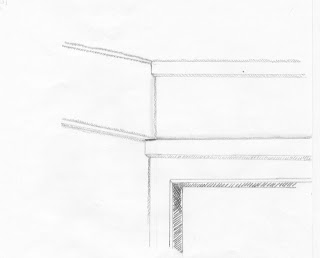
This freehand sketch is called a shade and shadow sketch. It was drawn at about 4:30 pm when the sun was still shining so I could draw the shade and shadows that the sun produced on some stairs and a wall that was connected to the stairs by my house.


 This sketch was a drawing of my own hand holding a tissue. I had to focus in on the shading and where my fingers were to make it look realistic.


This is not a freehand drawing but a freehand painting. My main focus was adding the color that I saw. To do this I tried to not think about it but just paint the colors that I saw. I tried to add texture to the apples and lemon.
This is a floor plan of my whole house and a sketch of my living room. This sketch helps me develop more skills in the scale of everything in the picture and my skills in drafting.


  This is a chair in my house that I drew in all different angles. I drew a front, side, perspective, underside and top view. This makes me understand how many angles an object can be drawn because most of the time people will only draw one angle of an object.  

This is a one point perspective of my living room at home. I had to draw it once in graphite and the other in ink. This shows a difference in contrast between the two pictures. What I learned after I drew this was that it takes time and the images have a lot of differences even though it is the same hallway.  


This is a one-point perspective that I just learned how to do. It is the side of a building and I wanted to include some road and clouds to make it a little bit more interesting. I tried adding shade and shadow to the building but it did not work out that well. I like one point perspective better than two point perspective. 


This sketch is called a one point perspective. It is the corner in my living room. This sketch helps a lot with shading. I added some interesting shading where the picture is placed. That shadow can act as a shadow or it could be seen as a piece of the painting.

  
 This is another two point perspective of an interesting building. As you can see that the sun is shining at it on one side so the other side is a lot darker, that is to show the shade and shadows. I learned that two point perspective can be fun and I like it better than one-point perspective because it adds interest to the space.

Saturday, April 28, 2012

Process Poster

For the creation of this poster, I had to show the process of how I made my Medieval textile. In this Poster I had to add my geometric pattern, pictures included in the geometric pattern, my 10x10 and 30x30 textile, and the pictures included in the textile. My skills have improved dramatically, I had so many obstacles in creating this poster and I over came them all. I have improved in IN Design and my attention to detail.

Tuesday, April 17, 2012

Resume

This resume was created in IN Design which needed to have an organized, readable layout and include my logo I had created earlier. I decided not to put my logo in the top left hand corner, instead I wanted to use it as the background. To use it as my background I had to enlarge it and lower its capacity so it has a fading effect. I have grown more familiar with the tools IN Design, I can use and create many documents for my future.

Monday, April 9, 2012

Logo

This logo was designed to symbolize me and to be creative in illustrator using different tools that I learned how to use. After creating this and various examples I have grown more experience in Illustrator, IN Design and Photoshop. Illustrator was the newest to me because I have already been introduced to Photoshop and IN Design. In Illustrator I can create different logos and even make my own pattern palette. I am looking forward to learning more in Illustrator.

Thursday, February 16, 2012

Sketches


 These sketches were done over a variety of weeks. Every time I sketch something it improves my ability to draw and sketch faster. I like to sketch because it's simple and when I sketch I can draw anything I want too. My weakness with sketching is that I erase a lot, and sometime I'd like too sketch something without erasing at all.

Reflection:
These sketches are a collection of my skill and progress of sketching over several weeks. Before you look at these I want to remind you that these sketches are not perfect, they reflect how well I interpreted the assignments. Even though I tried my best, some are a little odd. Each time before I started drawing I would read the assignments, think about what I would draw and interpret them. Some of the assignments were hard but I still tried my best. For my progress, it is a little hard to tell whether I made an improvement or not because some of the sketches in the front of the book are better than some of the ones toward the back. But to me, I think I made a tremendous amount of progress. I learned so much during sketching such as, good strategies for shading, lighting, and what pens and pencils work best. I will take what I've learned in these sketches and incorporate my knowledge into my future project. I hope you enjoy looking at my sketches.